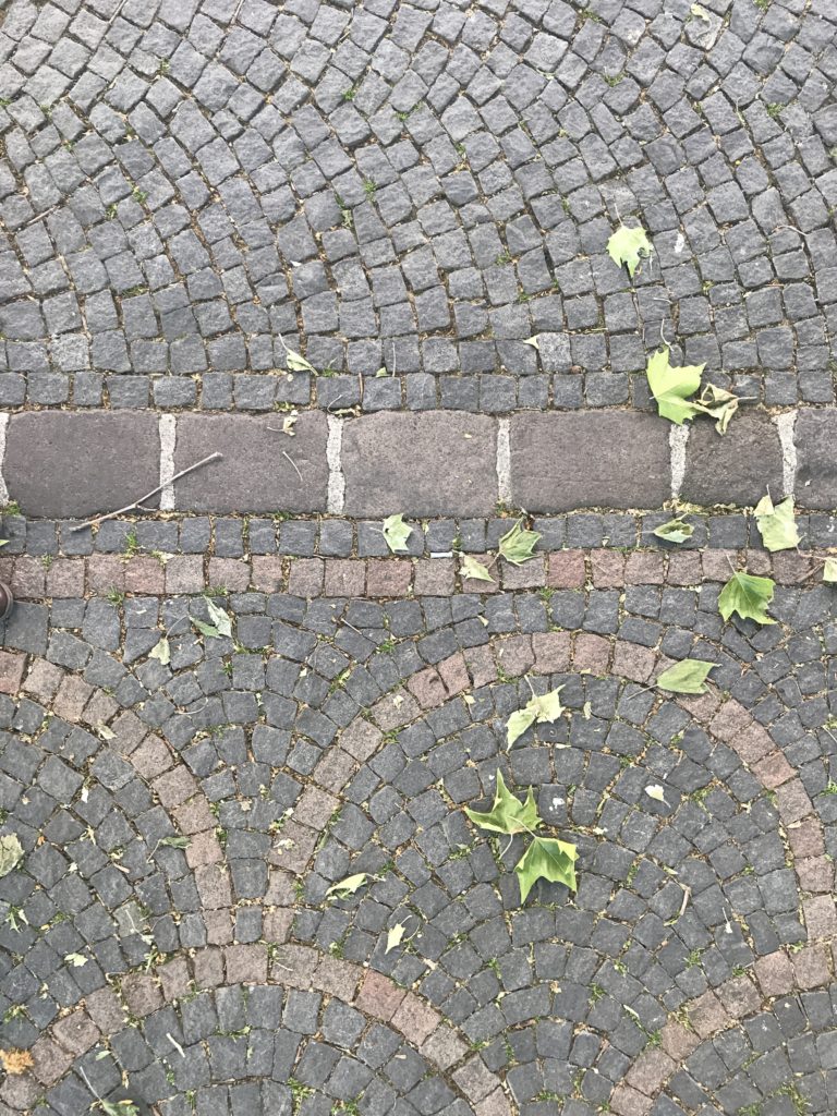
Attention wild human crossing!

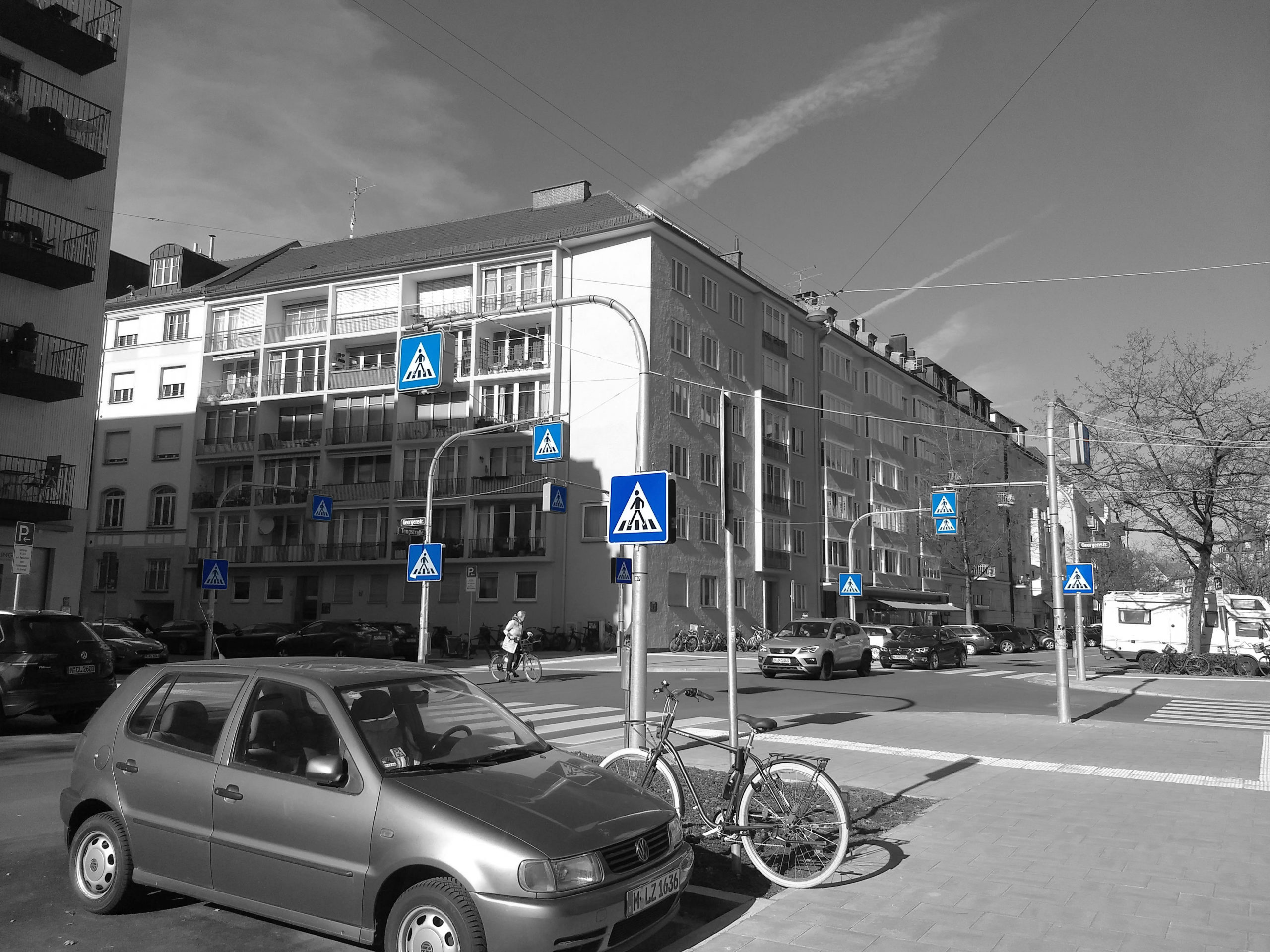
This very surprising scene can only attract our attention. This is a recent street refurbishment which sprang in my neighbourhood. 32. This is the number of signs signalling this pedestrian crossing on this relatively quiet residential road. The cherry on the cake is that they light up at night! I don’t know the story behind such a demonstration and it is very probably a sad one of a regrettable accident, but this can make us think. Is the person crossing there really at his ease? He is definitely visible and has a clear defined path to follow, but in such a calm neighbourhood one would usually cross casually the street without too many worries anyway. This is definitively a development made for cars and not for pedestrians. The vocabulary used is one of very simple signalling and strong contrast of colour. The ground coverage is explicitly different between the car zone and the pedestrian sidewalk. Pedestrians definitely walk on the side and not in the middle. The view opened at a maximum in order for car drivers to evaluate from a good distance the situation and decide to slow down or not. This car-designed space is definitively not welcoming for pedestrians.
The view of a Transport planner:
— by Carlos De Juan, a graduate transport planner from Universidad Politécnica de Madrid curently working at IDOM, consulting company in engineering, architecture and town planning
“Traffic engineers often fall into the paradox that the more safety infrastructure is deployed, the less safe a street can be. Although safety infrastructure such as traffic lights, zebra crossings, bulb-out curbs among others are designed to increase the safety of pedestrians, they can also do very little for them sometimes. Indeed, they try to accommodate pedestrians in a car-oriented street.
It all comes down to the street hierarchy and, ultimately, to driving speeds. Primary roads, with wider cross-sections, higher vehicular flow and, most importantly, higher driving speeds actually need to rely on this kind of infrastructure to increase traffic safety for pedestrians. The way this infrastructure works is by stopping all the agents. For instance, a traffic light first stops vehicles and pedestrians and then give way to any of them. For residential streets with lower traffic volumes and driving speeds it is quite the opposite. In this case, cars should be the ones to try to be accommodated in a pedestrian-oriented street. After all, we all want our kids to play on the streets, less pollution and noise around our home… That is, we need to design for people and not for vehicles. To achieve this, we need to make the vehicle feel out of place in these streets.
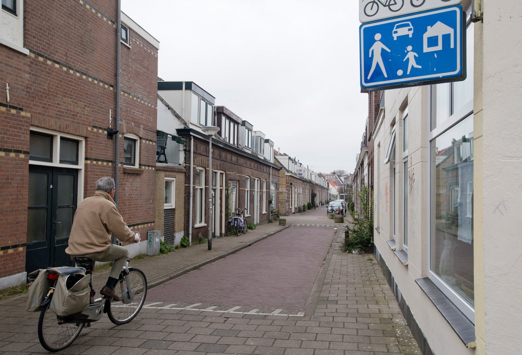
The Dutch have mastered this approach with the Woonerf, a concept that has later on been replicated around the world with different names such as Living Street, Shared Streets, verkehrsberuhigter Bereich and many others. They all lie in the same principle, the principle of uncertainty. The absence of signs, traffic lights or any type of control, entail an increase of awareness from all the street users. Social interaction and real-time negotiation is needed in order to solve any conflict. For instance, a simple look in the eyes between pedestrian and a driver or a cyclist can serve the purposes of deciding who yields in that specific moment. This uncertainty forces the driver to go slower to minimize the consequences of a possible accident hence reducing at the same time the probability for it to happen.
Shared street is the most humanizing urban/transport concept there exists. It relies on human perception, education, own interpretation of the situation and fosters human interaction, empowering social relations and empathy. It is, in the local scale, the most effective safety measure for residential streets and, ironically, the measure with less traffic safety infrastructure deployed.”
Pedestrians are essential for interesting streets
This equilibrium between driving space and space welcoming to the pedestrian is tacit and separation of those zones through boundaries don’t create lively streets! It is interesting to think on a design aspect how to promote the cohabitation of those uses which are fundamentally different. Driving is about strait, defined trajectories while walking is all about zigzagging from one side to an other according to what catches the eye, the weather, the ages, etc… Driving requires clear contrasts and strong readability as one needs to read a sign in a glance. On the opposite side walking allows time to observe, inquire, understand, appreciate details as one gets closer to things. Walking simply encourages more variety in the streets! And to allow this variety to thrive along other means of transport, crossing streets is a main topic.
This point is highly emphasized by Jan Gehl in the book “Cities for people“, as he explains in an interview for Archdaily:
“In the old metropolis, everything was made to a suitable size for a person, but after the introduction of modernism and the automobile, the importance of this scale was forgotten. We went from having architecture suited to the travel speed of 5 kilometers per hour, to entire cities of 60 kilometers per hour, which meant wider streets, bigger advertisements, higher buildings, where we weren’t able to see anything in detail as we moved so fast”
Ref: Alonso, Rodrigo. “Jan Gehl: “In The Last 50 Years, Architects Have Forgotten What a Good Human Scale Is” 28 Oct 2017. ArchDaily. (Trans. Pimenta, Amanda ) Accessed 1 Jun 2020, See article here
Creating a real fluid crossing
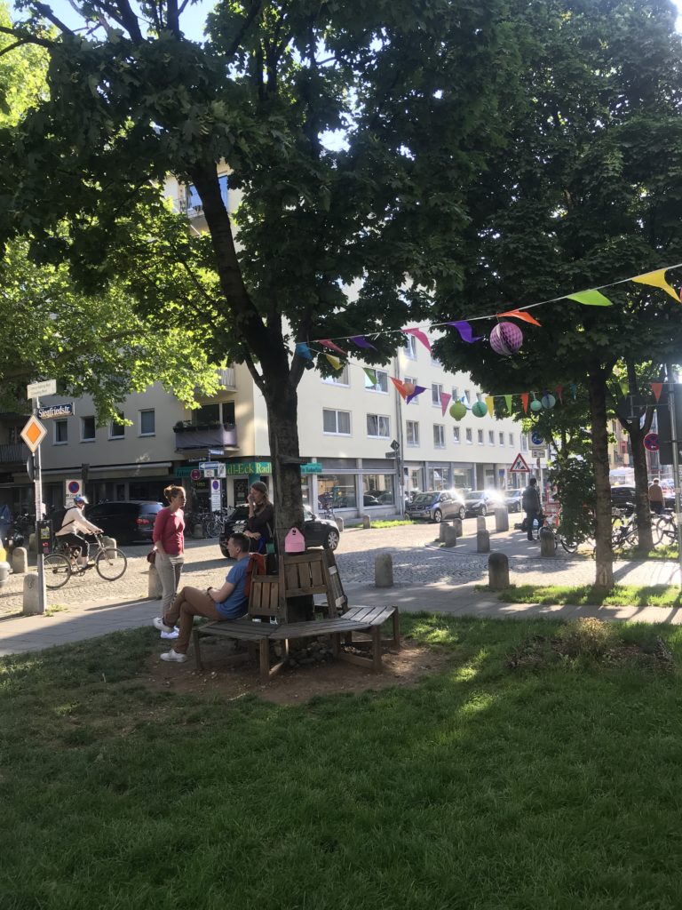
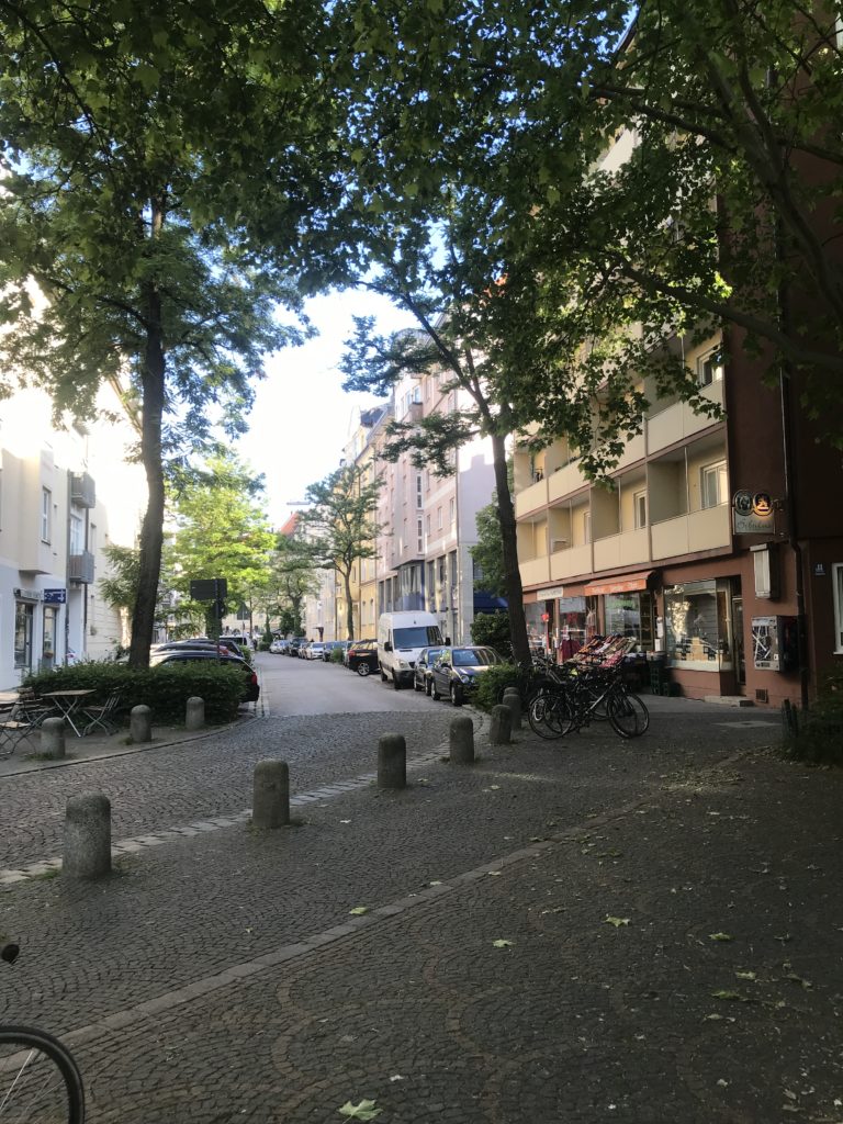
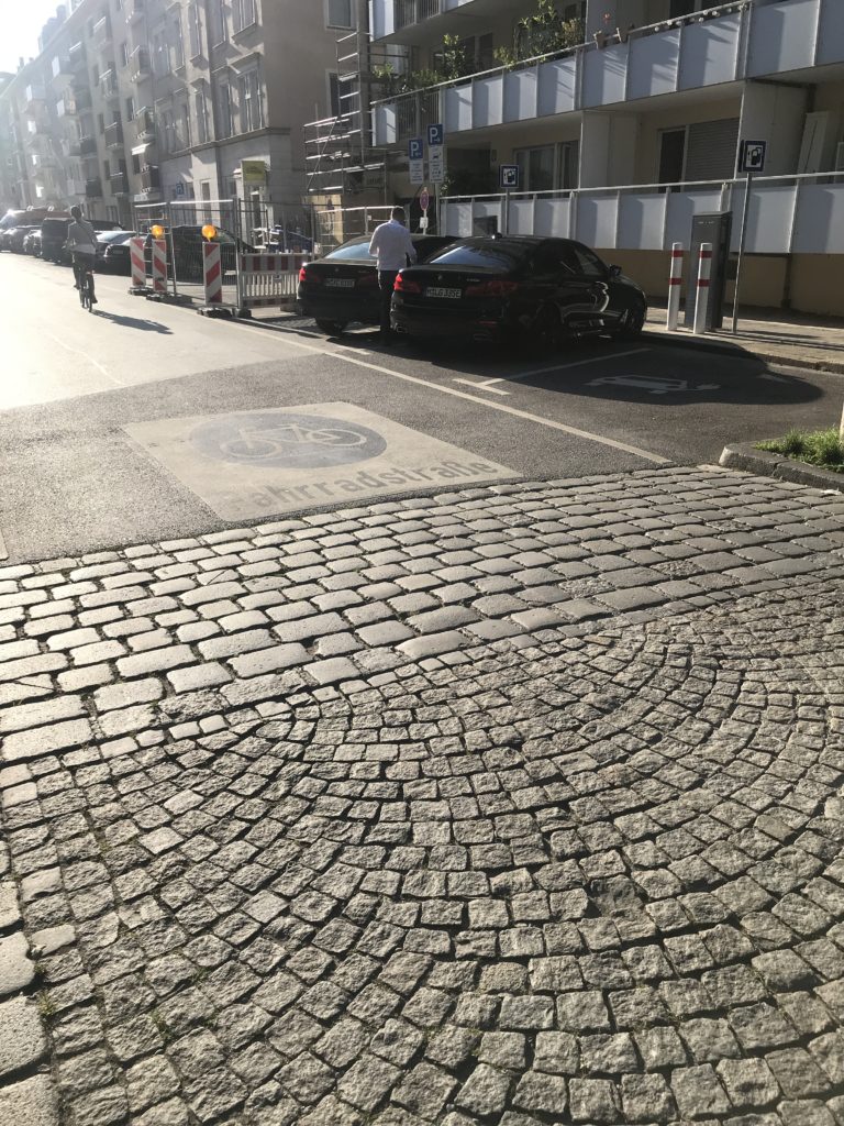
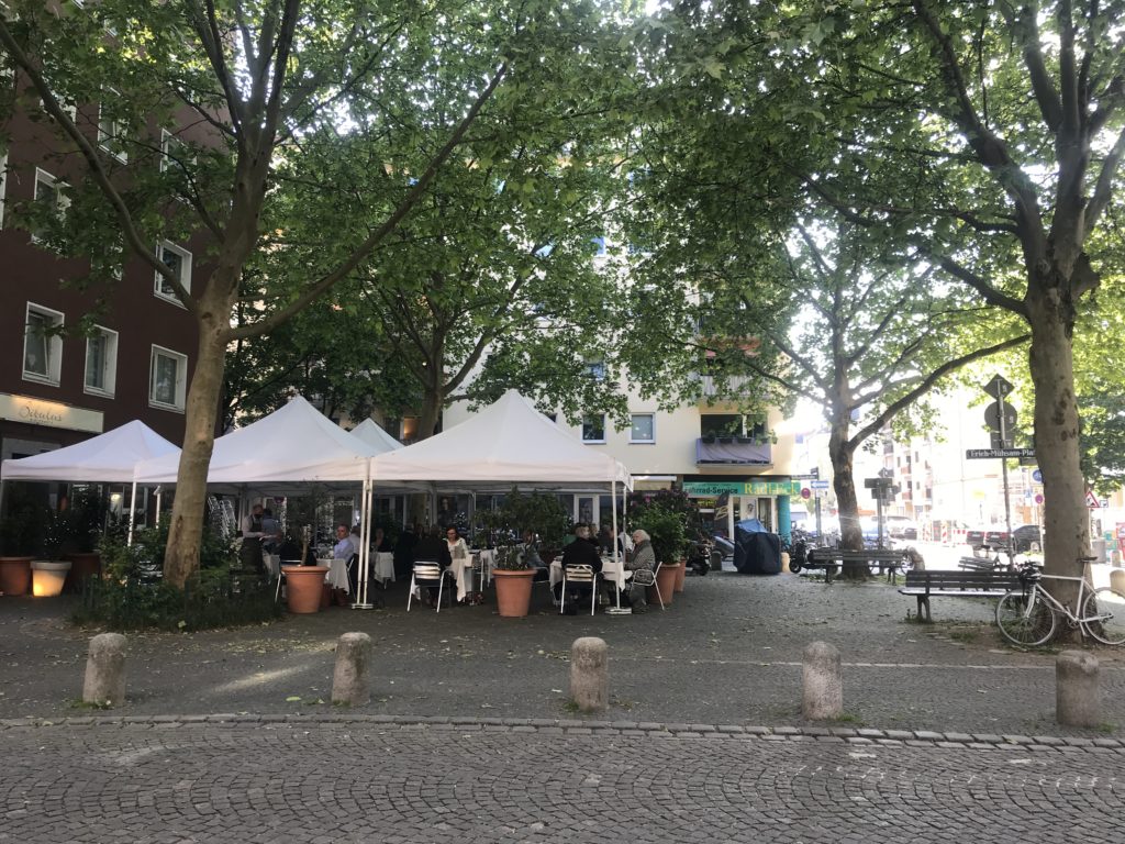
As described before Shared streets give a prevalence to pedestrians and allow to calm traffic. Although in complex situations with multiple crossing routes, such a comfort is not easy to implement. This is when more punctual solutions are key to fluidify urban life. A speed table enabling to rise up a large area can create, as they are called in France, “des Zones de rencontres”, meeting zones. This is when the street vocabulary changes and the street, as it is raised to the level of the sidewalk, allows perfect fluidity with the surrounding public spaces. Usually the driving zone is marked by bollards in order to limit vehicles from occupying pedestrian reserved spaces. These intersections are widely developed and can be found in many locations but seem to me underused compared to the positive effect they carry. Carlos with his Transport planner eye suggested a perfect example here in Munich at the crossing of Clemesstrasse and Wilhelmstrasse. As you can see below, the shaded square blends seamlessly in the street emphasized by a matching pavement pattern. Such a development is particularly appropriate in this case as many corner shops drive the activity to this crossing. Limiting their frontage to a narrow sidewalk with fixed crossing point would have been very unfavourable to their attractivness. We instantly have the feeling of a neighbourhood centre even though it does not rely on much (of course the bunting helps a lot). It is this subtlety and openness to possibilities which create this success.
To go further
And also:
Refferences
Articles
- https://www.citylab.com/transportation/2013/04/lots-cars-and-trucks-no-traffic-signs-or-lights-chaos-or-calm/5152/
- https://www.archdaily.com/877602/jan-gehl-in-the-last-50-years-architects-have-forgotten-what-a-good-human-scale-is
- https://www.nytimes.com/2013/04/28/automobiles/where-share-the-road-is-taken-literally.html?_r=0
Websites
Books
- J. Gehl, Cities for people, 2010, Island Press
- N. Soulier, Reconquérir les rues, 2012, Les éditions Ulmer
